
Redesigning user experience for Coverler - AI cover letter tool
Coverler is an AI-powered online tool that helps job seekers create personalized cover letters quickly and effortlessly. The project began within the Boosta startup factory and later grew into an independent product.
My Role
I led the UI/UX redesign of Coverler’s main sales funnel pages. I also worked closely with the founder throughout the whole process.
The main goal of the redesign was to increase the conversion rate of completed order forms and subscriptions by improving the overall user journey across the sales funnel - including the landing page, form, and pricing page.
Challenges
One of the biggest challenges was working within the no-code WIX platform, which limited design flexibility and required solutions that the product owner could implement independently, without developer support.
In addition, the timeline was extremely tight - I needed to deliver the first design within one week so the product owner could present the updated, production-ready website at a company business meeting by the end of the following week.
These constraints demanded quick decisions, creative problem-solving, and focus on high-impact UX improvements that could be implemented fast without loosing quality.
Flow analysis
To better understand user behavior, we started with an unmoderated usability study of the existing flow. Participants were asked to create a cover letter and share feedback along the way, including how easy the task felt, their overall perception of the product, and some follow-up questions.
After reviewing Hotjar recordings, analytics, and usability study data, I identified several key drop-off points:
Low engagement on the landing page: most users stopped scrolling after one or two screens. This indicates weak initial messaging and visuals.
Form abandonment: Users often left the form unfinished because all fields were displayed on a single long screen, with the “Submit” button below the fold, making the process feel overwhelming.
Input errors: Some users entered information incorrectly due to unclear labels and lack of helpful hints.
Unconvincing pricing page: Many visitors exited without choosing a plan because the pricing section didn’t clearly show what they would get or why it was worth paying for.
These findings guided the redesign strategy focused on clarity, simplicity, and trust.
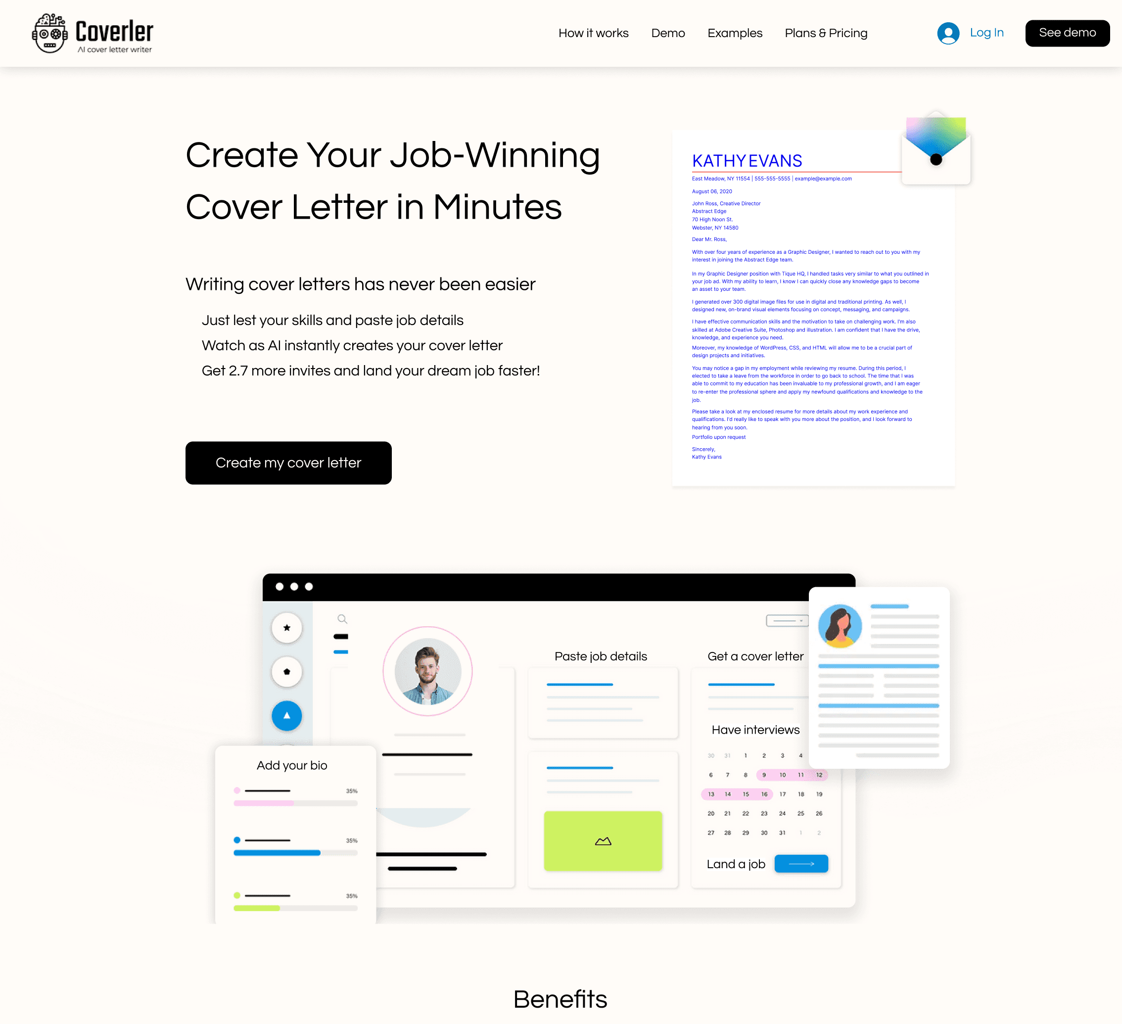
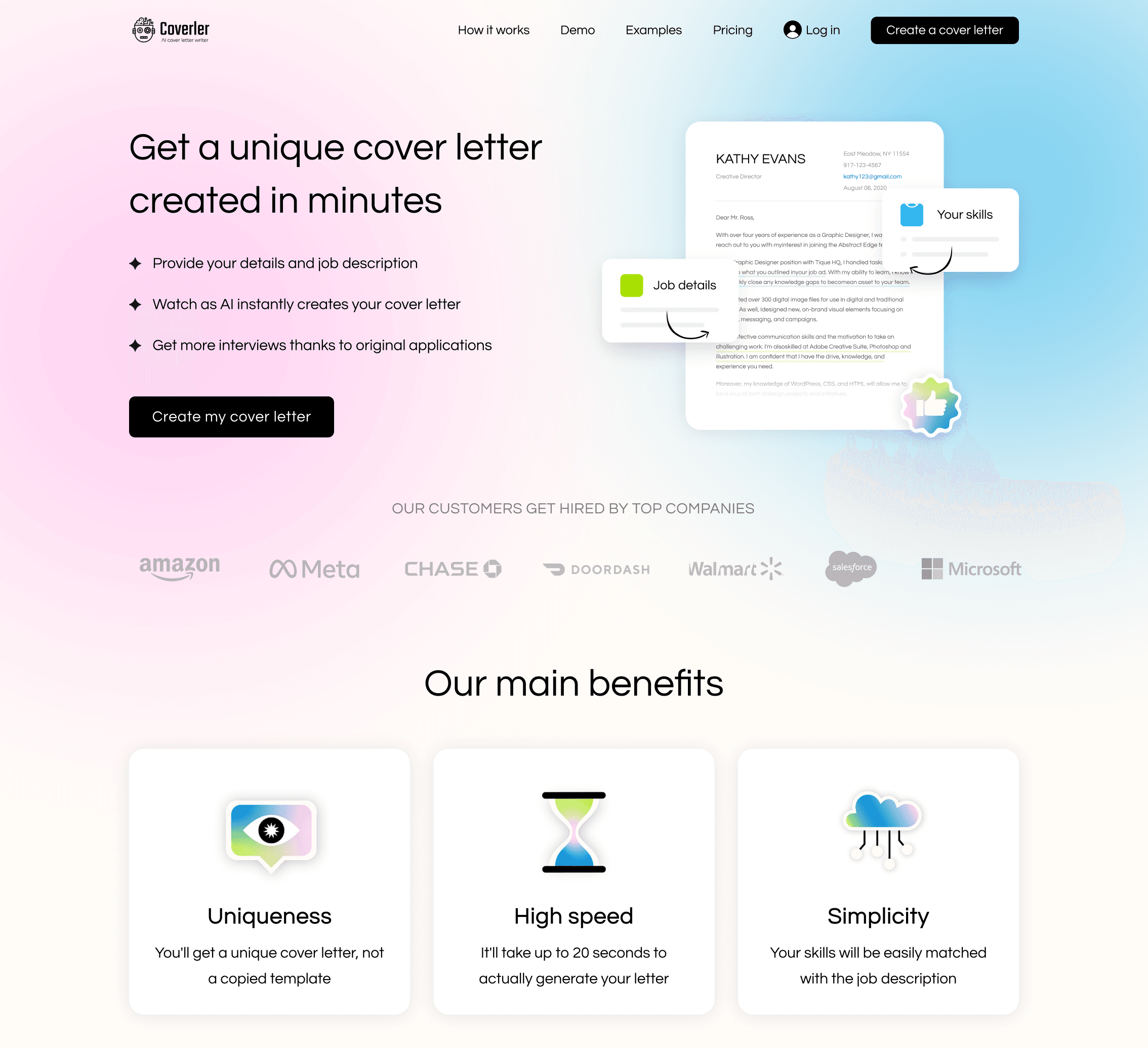
Solution 1. Landing page improvements
Starting from the landing page, I implemented the following changes:
Replaced generic stock images with a custom hero illustration for a more trustworthy first impression.
Highlighted key benefits and included real product screenshots and reviews to better communicate our value.
I collaborated with a content writer to enhance the titles and calls to action to guide users smoothly toward the next step.
Solution 2. The form redesign
Filling out the form is key to getting good results with a cover letter. To make this happen, I made the following changes:
Split the long form into four logical steps with a progress bar to reduce cognitive load.
Added clear field titles, placeholders, and friendly hints to guide users through completion.
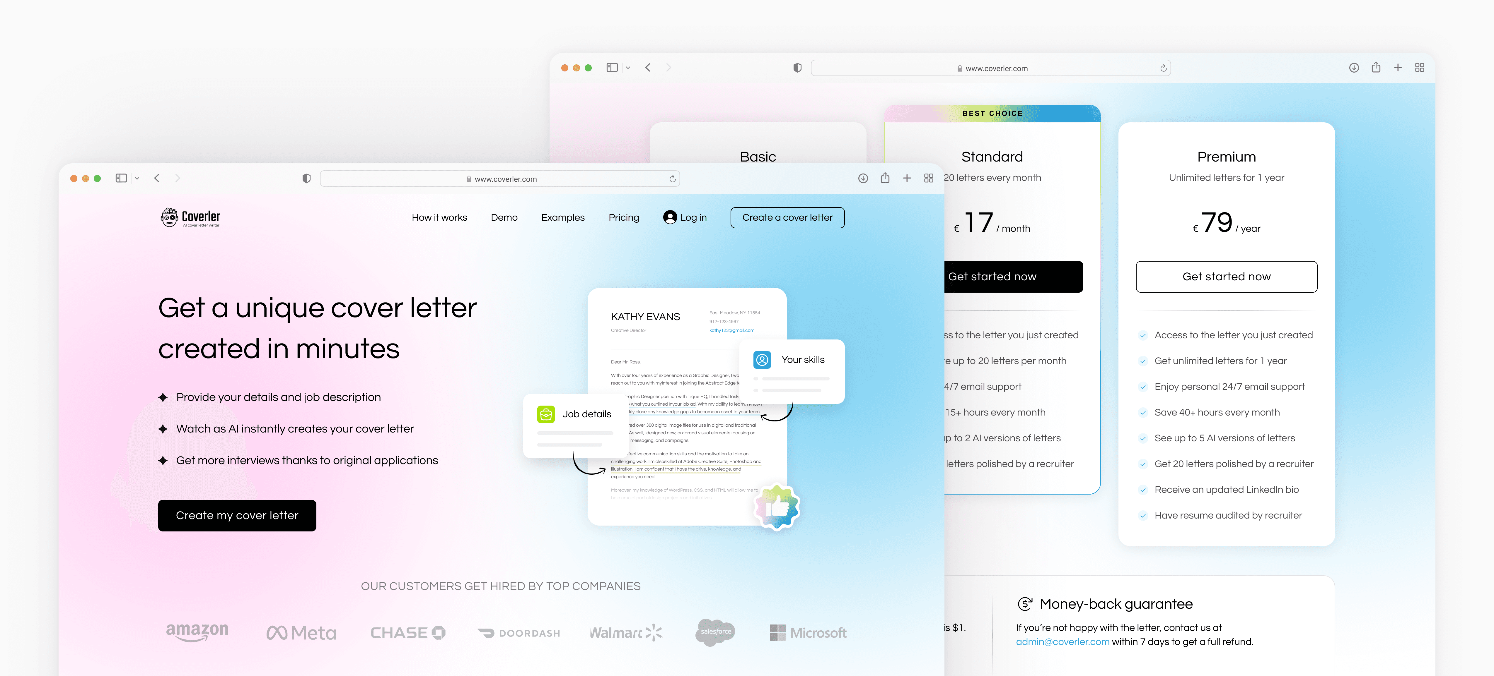
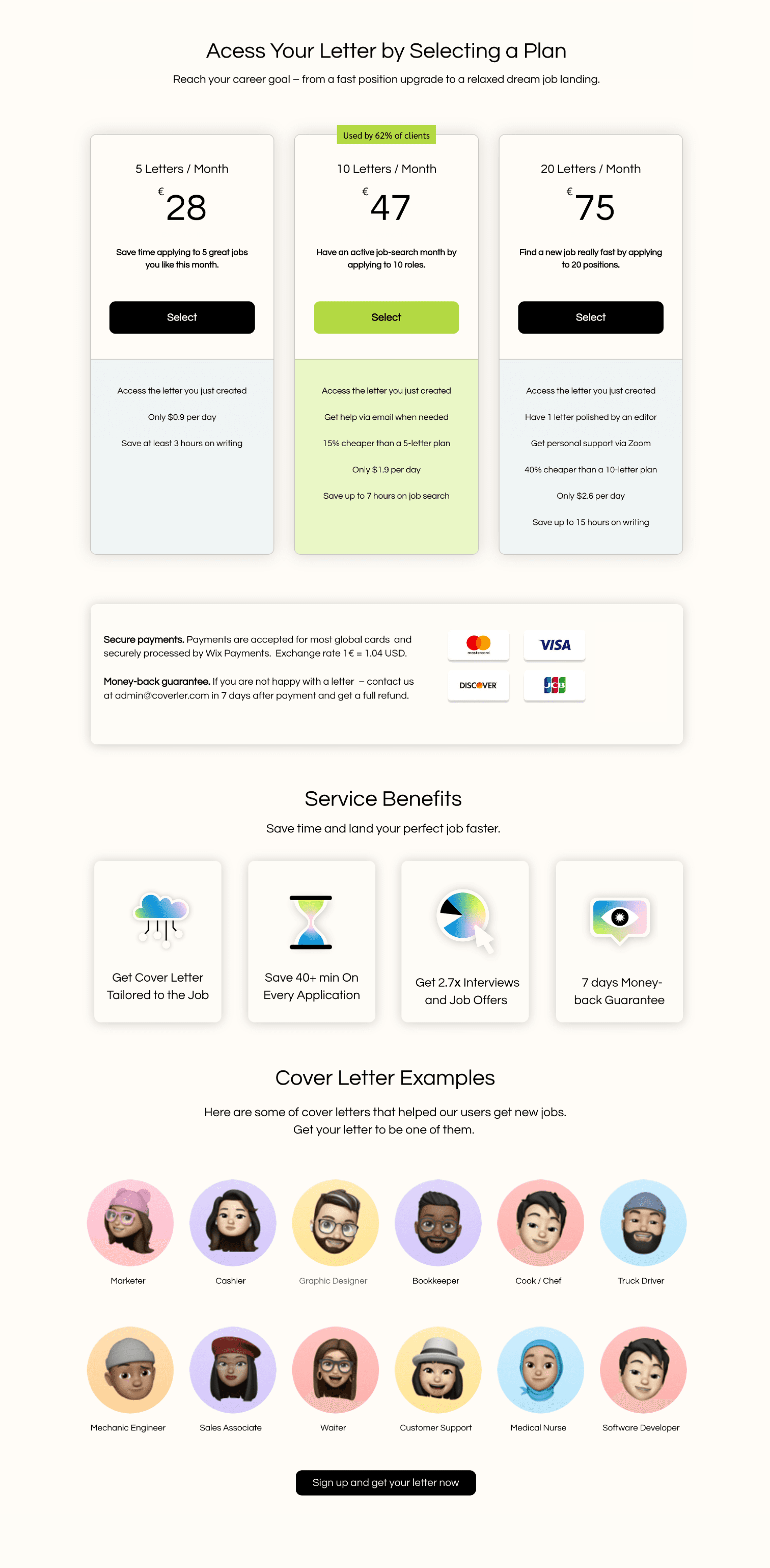
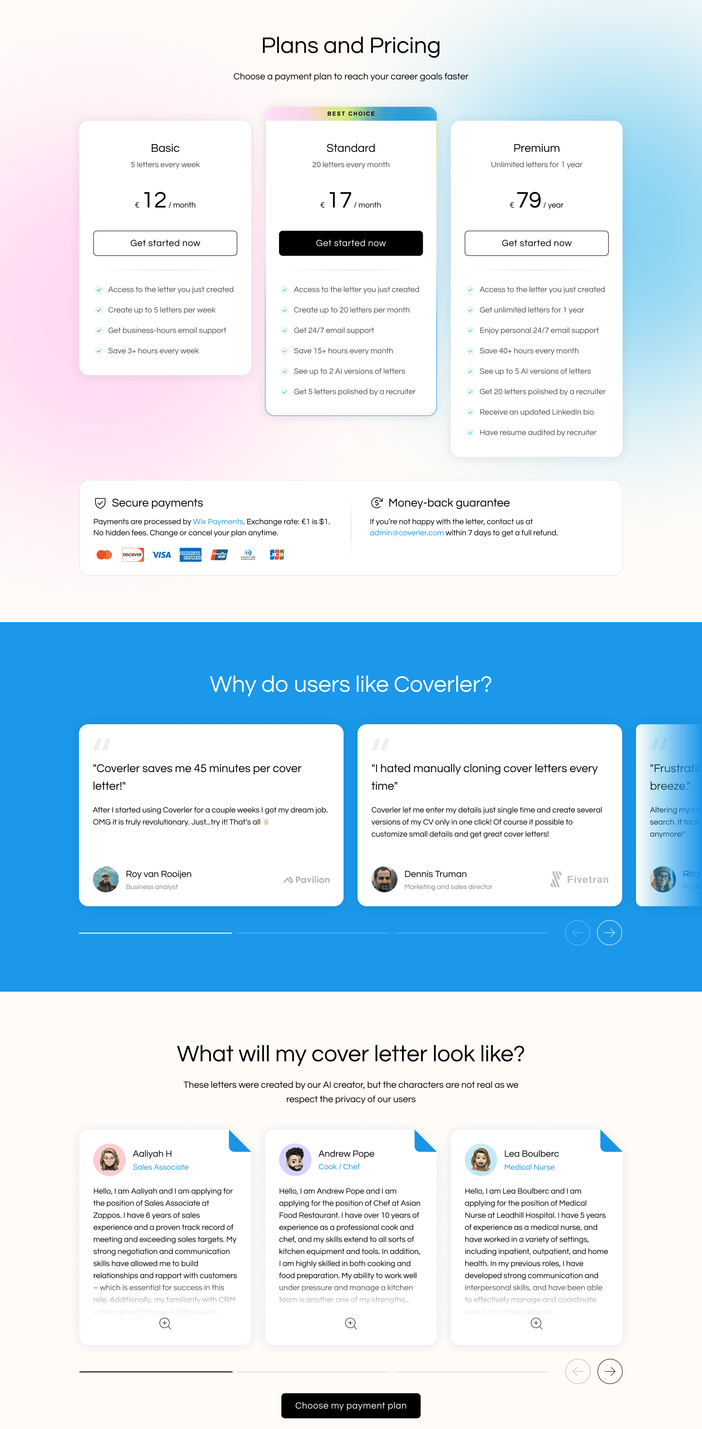
Solution 3. Pricing page redesign
Filling out the form is important for getting good results with a cover letter. To make this happen, I made the following changes:
Added a cover letter preview on the pricing page to showcase the service's functionality and value.
Redesigned pricing cards for clarity, visual appeal, and trustworthiness, finalizing with money-back and security guarantees.
Featured user reviews and cover letter examples to build trust and assure potential customers about the reliability and quality of our services.
Final design
Despite the no-code platform constraints and tight deadlines, I delivered a visually appealing and high-performing design for desktop and mobile. Real-world testing showed that each new version outperformed the previous one, improving both user experience and business outcomes.
Outcomes
The redesign led to significant improvements across all funnel stages:
+8% increase in clicks on the “Create my cover letter” button on the landing page.
+34% increase in clicks on the “Select Plan” button on the pricing page.
+64% growth in subscription conversions during the first weeks after redesign.
Noticeably longer engagement time on key pages and fewer drop-offs during the form submission.
As a result, Coverler secured the next round of funding and launched a new independent domain, integrating the UX strategies established during this MVP redesign.
I’m grateful to have contributed to this product and to have learned that meaningful UX improvements are possible even within tight technical constraints.
Thanks for watching!
Enjoyed my work? Let’s connect and explore opportunities!

